- 70% of Canadian consumers actively look for products marked as Canadian-made
- 91% of shoppers prioritize Canadian products
- Brewery closures in Ontario have begun to outpace openings for the first time in 15 years
Experts would likely conclude that Muskoka Brewery's strategic rebranding aligns with current market trends, emphasizing Canadian pride and sustainability to differentiate itself in a competitive and challenging craft beer landscape.
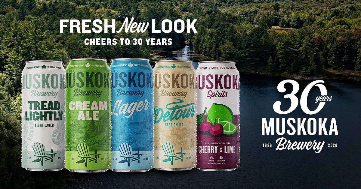
Muskoka Brewery Unveils New Look for 30th Anniversary
BRACEBRIDGE, ON – February 25, 2026 – As it marks three decades of brewing in the heart of cottage country, Muskoka Brewery is rolling out a significant packaging refresh across its core portfolio, a strategic move designed to strengthen its shelf presence and deepen its connection with consumers in an increasingly competitive market.
The Bracebridge-based company, one of Ontario’s largest and longest-standing craft breweries, unveiled the new look for its iconic Cream Ale, Muskoka Lager, Detour, and Tread Lightly beers, as well as its Muskoka Spirits Vodka Soda line. The change signals a new chapter for the proudly Canadian-owned brewery as it navigates the evolving landscape of the craft beverage industry.
The Art of a Strategic Refresh
More than a simple aesthetic update, the new packaging is the culmination of over a year of intensive consumer research and design exploration in partnership with strategic creative agency Blackjet. The goal was to create a look that stands out on crowded retail shelves while honouring the brand’s storied past.
“This refresh is about showing up as strong and confident on the shelf as we are in the glass,” said Kristin MacDonald, Vice President of Sales & Marketing at Muskoka Brewery. “After 30 years, we knew it was time to evolve - not by chasing trends, but by listening closely to our drinkers and honouring what makes Muskoka, Muskoka.”
Consumer insights revealed a strong desire for a cleaner, more modern appearance that improved brand recognition, while retaining the heritage and personality that loyal fans have connected with for decades. The new design addresses this by placing greater emphasis on the bold “Muskoka” name, making the products easier to identify. Signature colour palettes for each brand remain, but are now refined with cleaner lines and contemporary details intended to resonate with both long-time enthusiasts and a new generation of craft drinkers. The collaboration with Blackjet, a finalist for Small Agency of the Year in 2025 with an award-winning portfolio, underscores the strategic weight behind the visual overhaul.
Navigating a Crowded Craft Market
The timing of the refresh is critical. The Ontario craft beverage market, while vibrant, is facing significant headwinds. While the number of craft breweries in the province has multiplied over the past decade, the industry is also grappling with inflation, market saturation, and a decline in overall beer consumption. For the first time in 15 years, brewery closures have begun to outpace openings, making brand differentiation more crucial than ever.
Muskoka Brewery's strategy directly confronts this challenge by leaning into a powerful and growing consumer trend: a fervent desire for local, Canadian-made products. For the first time, the brewery’s packaging features a prominent Canadian-made callout, highlighted by a subtle but meaningful maple leaf. This move is strongly supported by market data, which shows that over 70% of Canadian consumers actively look for products marked as Canadian-made, and a similar number are willing to pay a premium for them.
This “Buy Canadian” sentiment is driven by a desire to support local economies and a trust in Canadian quality standards. With an estimated 91% of shoppers prioritizing Canadian products, the brewery's clear labeling positions it to capture this groundswell of national pride.
“Choosing Muskoka means supporting a brewery that’s truly local - owned here, brewed here, and deeply connected to this place,” MacDonald stated, reinforcing the brand's commitment to its Canadian identity.
Celebrating a 30-Year Legacy
Beyond market strategy, the redesign is a celebration of the brewery's deep roots in the Muskoka region. The iconic Muskoka chair, long a part of the brand’s imagery, now plays a more central role in the new designs. It serves as a powerful symbol of the cottage country lifestyle—of dock days, campfires, and cherished traditions that the brewery’s beverages have been a part of for three decades.
This visual storytelling is paired with elevated illustrations that reinforce the brewery’s unique connection to the place it calls home. It’s an assertion of authenticity in a market where origin stories are a key currency.
“No other brewery gets to call Muskoka home the way we do,” said Todd Lewin, President of Muskoka Brewery. “This refresh celebrates that proudly - while carrying the responsibility we feel to the fans who have welcomed us into our cottages, campsites, and traditions for three decades.”
To align with modern consumer values, the company is also taking a thoughtful approach to the transition. To minimize waste, Muskoka Brewery will continue to use its existing packaging materials until inventory is depleted. This sustainable rollout means consumers may see both the classic and refreshed designs on shelves for a limited time, a move that reflects a growing demand for eco-conscious practices from brands. The full transition across Ontario is expected to be complete by the May 2–4 long weekend, the unofficial start of summer and a peak time for the cottage country lifestyle the brand embodies.
The refreshed cans are now beginning to appear in LCBO locations, The Beer Store, grocery retailers, and licensed establishments across the province, offering a first taste of the brewery's next chapter.